Header

Blogposts
Written by Bernardo Macapagal
Nov 01, 2026
After many months of having my portfolio live as part of a college project, it was finally time for a fresh start. There were a few things I didn't like about my initial website. It was rushed, looked generic, lacked a lot of elements, and had no clear sense of direction.


It didn't showcase my full potential, which are very important when it comes to landing a job. You can be the best in the world, but if no one knows you exist, then it's all for nothing. Even dogs with Canva get hired more than me. So, it was time for a change.


But before that, let's take a look at what my old portfolio looked like. It featured a dark background with purple highlights, a space theme, and a silhouette of multimedia icons. However, it lacked the process behind my work in the case studies, the pages weren't optimized, and the dark design was hard to read, especially on resumes.
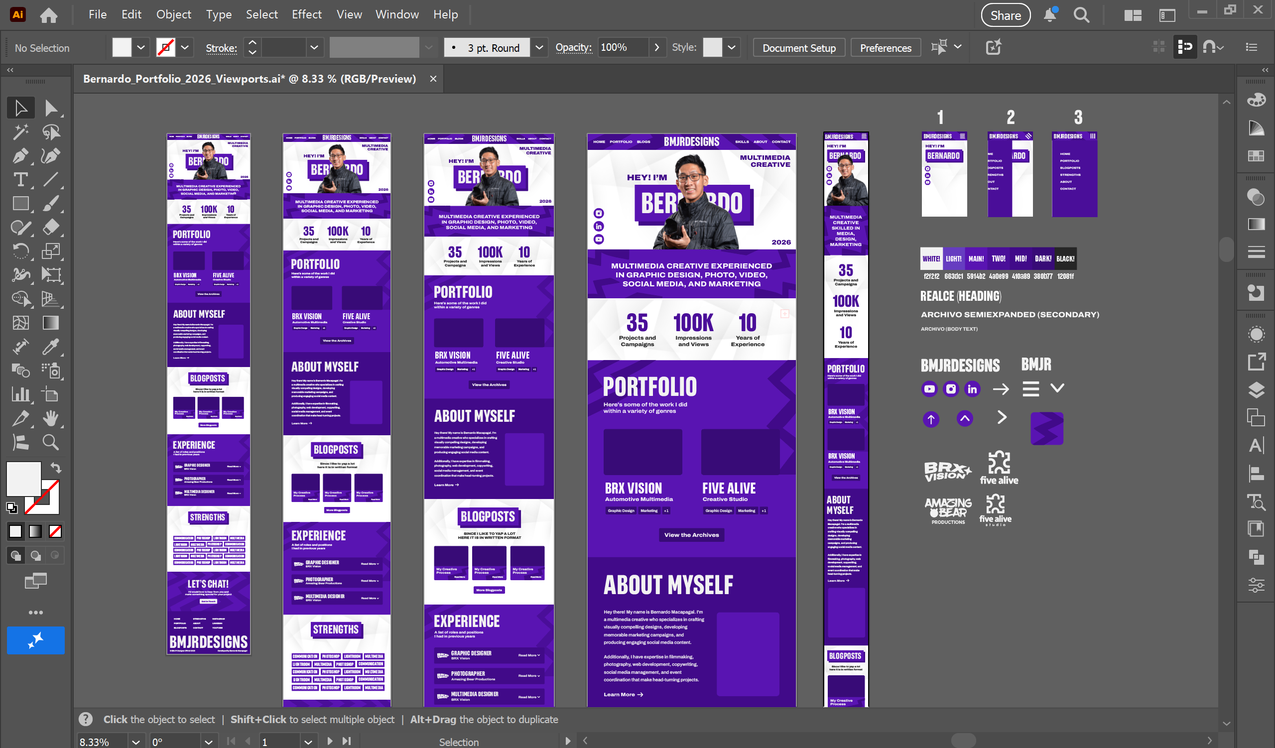
Kicking it off, the redesign is inspired by my previous portfolios, all the way back to the beginning. We still have the classic purple theme, now with brighter tones, paired with sharp zigzag lines in the background to convey dynamic energy. Our main text element is a three-dimensional frame with a two-tone look for our headline titles.


Coming next, I finally transitioned to light mode for greater brand flexibility, so viewers no longer have to squint to see my work. Instead of using a plain white background that could look bland, I played with textures to add visual interest. The typography features a tall-and-wide combination of clean sans-serif fonts for better readability.


In terms of content, I added new sections and features, such as in-depth case studies that really dig into my process, key blog posts like this one, experience walkthroughs, detailed stories, highlighted strengths, integrated pages, and statistic counters. What I love about the new website is how it truly showcases me and my capabilities.
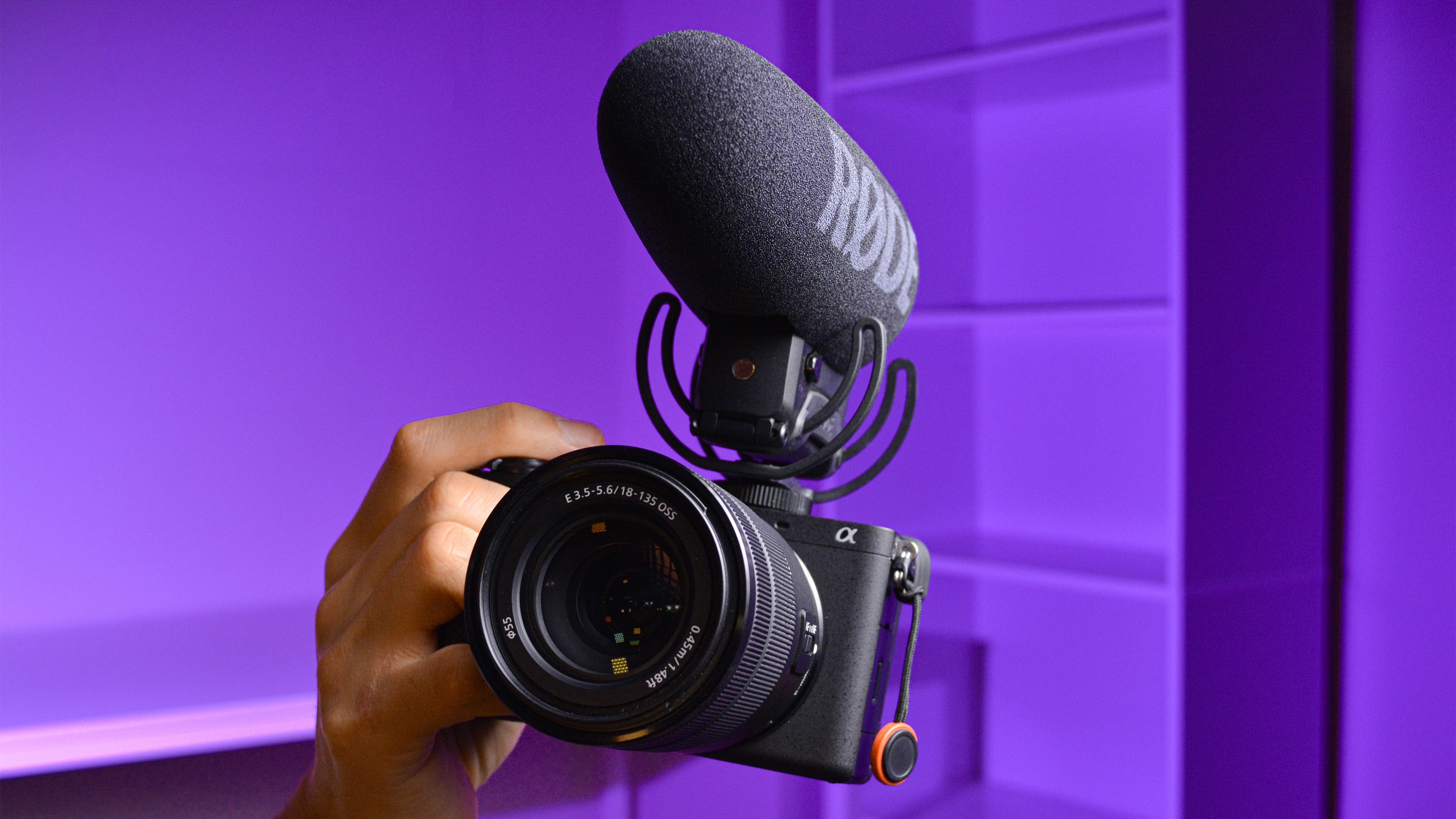
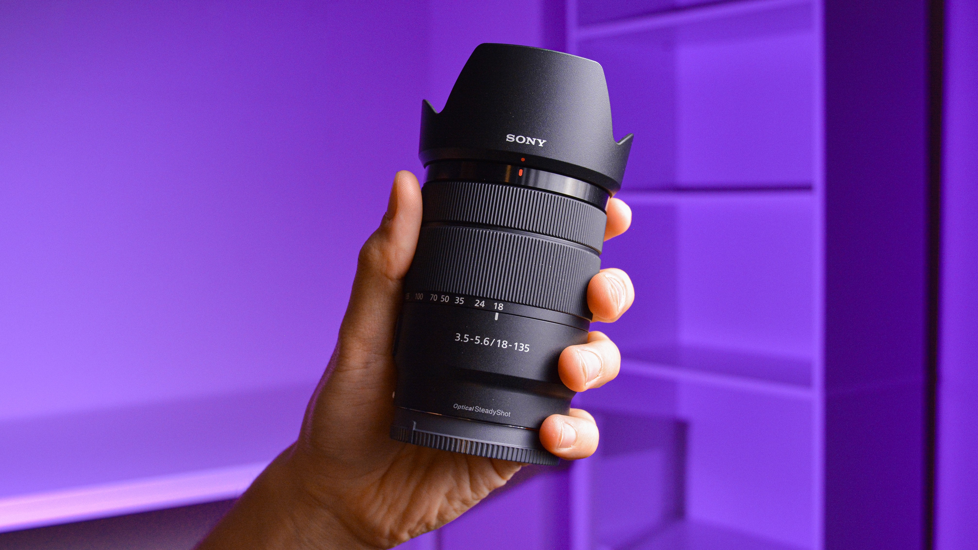
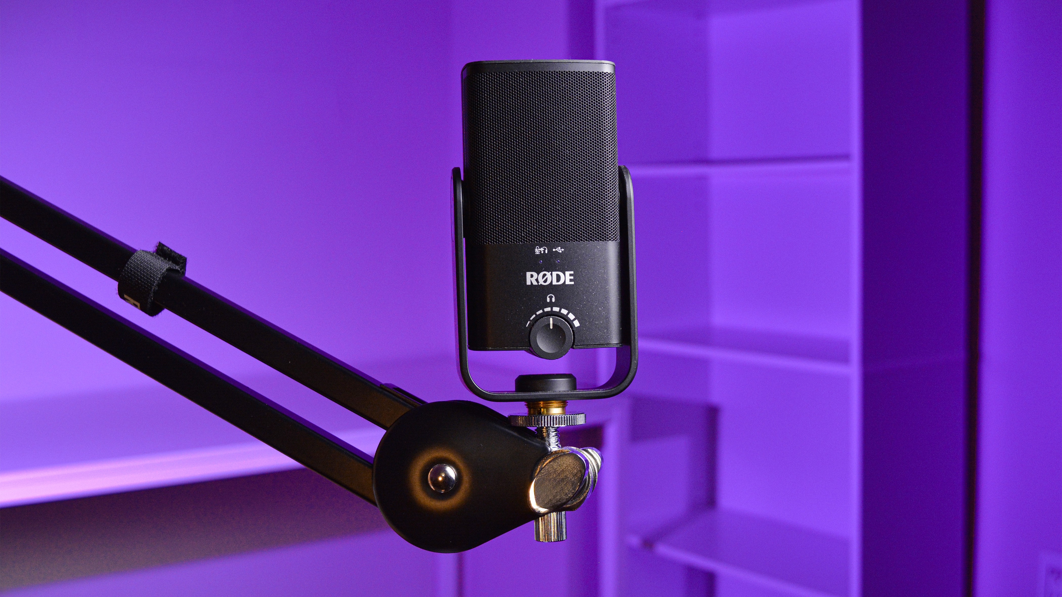
Photography brings the whole portfolio together by adding a human touch rather than relying solely on digital graphics. I shot a couple of portraits of myself in different, exciting poses, along with blog post thumbnails featuring compositions of my video gear. I used two speedlites with diffusion modifiers and a purple color gel.
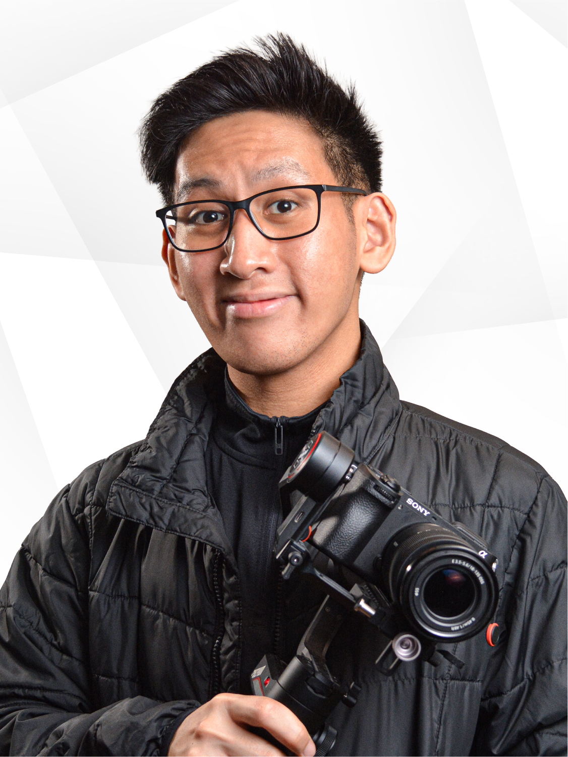


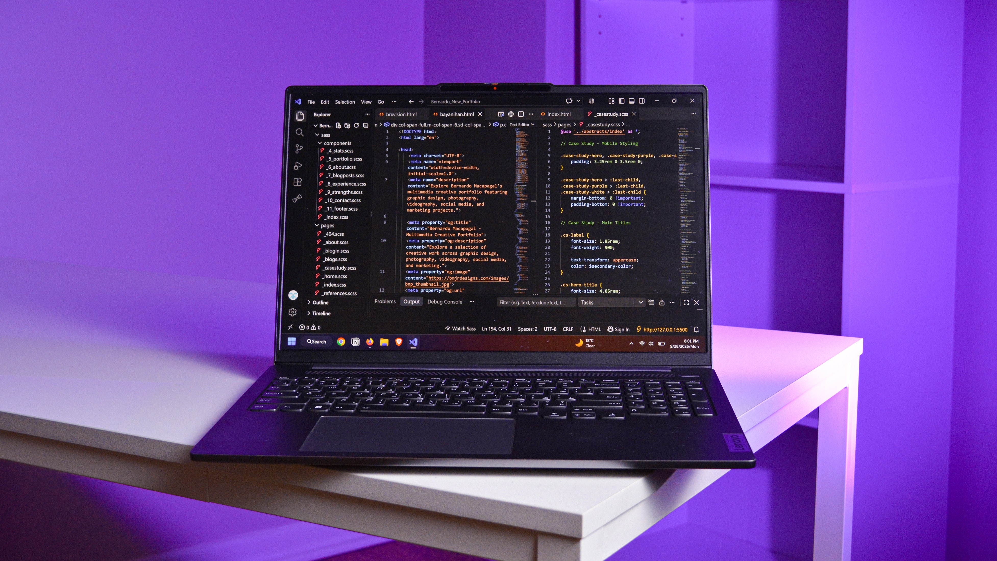
Adobe Photoshop was used to color-correct and clean up the images, as well as crop and optimize them for the web. It was an overall fun process, from experimenting with different facial expressions to gathering all my equipment for a mock product shoot. Adding colored gels to fill the white background was also a great move for branding.

Not only did I revamp the design, but I also overhauled my development framework. Everything was elevated, from the organization to the features. This included templated modules, consolidated properties, smoother GSAP animations, interactive elements, parallax sections, modern hover effects, number counters, and slideshows.

It was fun getting back to coding and testing my college knowledge. I actually improved my skills in development and maintaining a proper architecture throughout this project, which took three months and over 350 GitHub commits. The pages I developed included home, about, blogs, case studies, coming soon, 404, and references, all built using my usual tech stack: HTML, CSS, JavaScript, and VS Code.


